The reviews are over and the verdict is out.... thanks for your votes and you can read the comments left below. Look for the book Space Scurvy - The Two Islands of Captain Culpepper coming out in February.
 |
| COVER A |
 |
| COVER B |
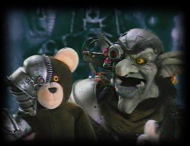
A Day in the Life of a Friendly Space Pirate. No I'm not a Space Pirate, but I created one called Zargon and puppeteered him in a show I produced called Planet Bizzaro. I liked the character so much I named my blog after him.

|
| COVER A |
|
| COVER B |
Cover A is Brilliant!!!
ReplyDeleteGo with Cover A! It stands out more compared to Cover B. And the characters look really awesome in A! Am lovin' that weasel-thingy-creature with the helmet! - Steven Bone -
ReplyDeleteI like Cover B. But one of the experts chose Cover B cos she says the characters look more interesting.
ReplyDeleteCover A- more kiddie. B is more tween. Methinks cover A
ReplyDeleteIf you could combine the front cover page B to back cover page of A that would be great because the background and character of cover A, stands out more but cover B is more elegant. Else i would go for cover A, picture speaks a thousand words.
ReplyDeleteCover A! I think young kids will pick the book right off the shelf. Reminds me of nickelodeon.
ReplyDeleteCover B is more Disney. The characters are more 3D looking. Though very nice too, might target an older kids age group.
I like A as it seems to follow the theme/look of your other books. Colourful too :)
ReplyDeleteAlways A..
ReplyDeleteBut cover A background could show more spacey feel.
(COPIED FROM FACEBOOK)
ReplyDeleteHey Uncle B! I strongly suggest using Cover B for a number of reasons; however, they both have their good points. Cover B is graphically richer than Cover A, and less busy from too many characters. 'A' does show the one whom I suppose is the villain which is helpful, but the story outline on the back looks randomly placed. What could help that would be to give the words a background and align text to center. Aside from a cleaner layout, 'B' shows your name in larger print than Marc's; considering you wrote the book, it makes more sense.
Without a doubt, Cover B gets my vote! P
(COPIED FROM FACEBOOK)
ReplyDeleteI say Cover A.
It's more attractive, it's got more characters, and the blue captain, whom I assume is the main character, is more prominent than on Cover B
(COPIED FROM FACEBOOK)
ReplyDeleteBrian, I love your blog!
I was reading the responses in the voting and I have to agree with the person that compared the two covers to Nickelodeon and Disney. The first one reminds me of SpongeBob, and B is very Disney. Cover B caught my eye quickly, but cover A made my eyes linger.
I vote A.
Can't wait to see what the final result is. HAPPY NEW YEAR!!!
(COPIED FROM FACEBOOK)
ReplyDeletePeggie Lim January 4 at 10:17pm Reply • Report
HI, I like Cover A...
(COPIED FROM FACEBOOK)
ReplyDeleteCover B!
(COPIED FROM FACEBOOK)
ReplyDeleteArturo Gill said
B is my choice
Hey Brian,
ReplyDeleteBoth covers are great but if you want me to only choose one... Then it will have to be Cover B!! I like it abit more than the other :)
Hugs
Dave
Hi Brian,
ReplyDeleteI like cover B. The reason is because the characters reach out for me welcoming me to join them on their great adventure. I'd more more likely to pick up that book than the other.
Cheers, Christian
(COPIED FROM FACEBOOK)
ReplyDeleteA is more visually appealing I supposed :-). Happy New Year Brian !!
(COPIED FROM FACEBOOK)
ReplyDeleteI couldn't post on blog. I like the title font and characters on B, but I like the villain in A. Help?
(COPIED FROM FACEBOOK)
ReplyDeleteI vote for cover B. I dont have any of those accounts to post a comment to the page. Hope your doing good bro.
Love and Respect.
(COPIED FROM FACEBOOK)
ReplyDeleteI'm going to go vote through the blog, but just fyi... Cover B :D Looks great!
Cover A looks catchy! I choose that! B looks more teenager-y. :D big hug
ReplyDeletewell u can mash up both the big guy in cover a to cover b
ReplyDeleteeven cover b is edgey and 3d ish... guess need more graphic at the back cover
than it will be perfect
Brian, this is Jean , I like Cover B !!
ReplyDeleteCover A :) The words stand out more... seems more balanced and brighter.
ReplyDeleteCover B has a nice image but design-wise seems a bit too photoshoppy and unbalanced (for one thing, the circle with the two characters is not in the middle!) plus that font with the thick shadow is not very appealing!
(COPIED FROM FACEBOOK)
ReplyDeletehi brian.. i vote for cover B.. its look nice & classic for pirate tale..
(COPIED FROM FACEBOOK)
ReplyDeletehi brian...cover B :)
(COPIED FROM FACEBOOK)
ReplyDeleteAmazing how subjective art is. For me, definitely keep 'The Two Islands of Captain Culpepper' in cover B (Nice font and size). Showcase more of this book's brilliantly illustrated characters...give readers a preview of the myriad of cool characters in the book. The map and the 'X' in Cover B instantly indicates a pirate and adventure theme -- nice. Perhaps a bit more outer-space background in cover B to distinguish this as a Space Pirate story. The torn parchment on the back cover is a nice touch...torn parchment sells. If I had to pick one, I would go for cover B but if I could mix things up, it could be something like the image below.
Hey Brian, your blog is really such an inspiration..you are one really creative fella! I say Cover B...clean, clear, neat and I find it more appealing than the other one! Can't wait to read the book! Let me know if you need my help editing! Val
ReplyDeleteTough choice! The little boy in me prefer A and the little girl B! It's B for me for now, though at first sight, I'll pick A!
ReplyDeleteAren't you confused already Brian? I don't even know if I should add to it. I think the 3D effect sells better than the 2D in Cover A (as do movies nowadays). However, I think Cover A has more character. Maybe 3D characters on Cover A. Cover A's back page wins.
ReplyDelete(COPIED FROM FACEBOOK)
ReplyDeleteBrian, not sure how to blog... good to see ya on facebook. wish you the best. Cover B is my choice. Man, I still talk about your VW bug converted convertable. Have fun Brian.
(COPIED FROM FACEBOOK)
ReplyDeleteI like the picture of Cover A but the font style of Cover B is much better. Cover A tells more about your story, it has the intergalactic kind of look, while cover B looks like an old map use by sailors or pirates at sea kind of thing. Is this book going to be available in our local market? or you will put it in the internet like before?
(COPIED FROM FACEBOOK)
ReplyDeleteCover B is cool but I think Cover A speaks to me more
(COPIED FROM FACEBOOK)
ReplyDeleteCover A i like
(COPIED FROM FACEBOOK)
ReplyDeleteI'll also give my vote to Cover A